

cross-posted from: https://lemmy.world/post/17714161
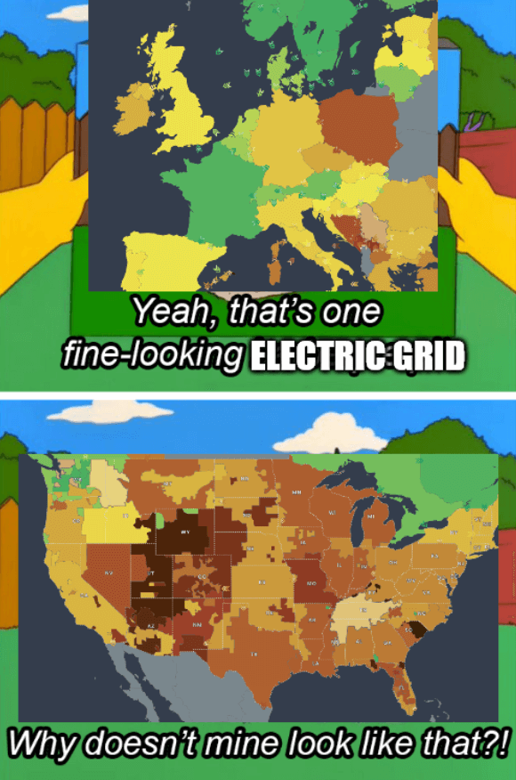
Source - The colors of the grids represent CO2 emissions
The title is a reference to the 2021 Texas power crisis
In terms of area, aren’t the size of the various American grids roughly the same size as the ones that comprise the individual countries in Europe?
Yes, for a sense of scale, Pennsylvania (rectangular one in the top right) is about the size of England
Did they merge Belarus and Ukraine on this map? Also Poland’s out here trying to be American.
Poland loves her coal
You can see a faint border - they’re just both gray, I assume for no data like Kaliningrad and Albania.
Poland is actually trying to be Amerikkkam, they are obsessed. They even tried going for the extreme racism.
Belarus was actually always Ukrainian territory, historically…
I mean, if that excuse works for russia, why not us?


